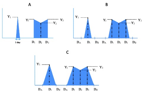
Figure 1.
Schema depicting the patterns of virus shedding for three possible scenarios, A, B and C, graphically representing the minimum, midpoint and maximum AUC calculations, respectively, defined in the Methods text. For each scenario two example episodes are shown, the first with only one virus positive sample, and the second with three virus positive samples. Y i – Log viral density values; D A – Day of last negative sample before start of episode; D B – Day of first negative sample after end of episode; D 1 – Day of first positive sample; D 2 – Day of second positive sample; D 3 – Day of third positive sample.

