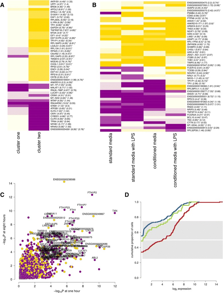
Fig. 2.

Cell cluster gene expression. In each plot, yellow indicates increased and magenta indicates reduced gene expression. a-b Heatmaps of the top 50 gene expression results, ranked by statistical significance, are shown for clusters one and two over time (a) and cluster three versus other cells, broken down by culture condition (b). The numbers provided in parentheses in this and other heatmaps are -log10 p-values for differential and heterogeneous (context specific) expression respectively. Results that are globally significant after 5% false discovery rate (FDR) correction are marked with an asterisk. c The differential expression results for cluster one versus other cells at one and eight hours. d A cumulative proportion plot for FOXP1 expression broken down by cell clusters. As in other plots, clusters one, two and three are plotted in red, blue and green respectively. Each line plots the cumulative proportion of cells at or below a certain expression level. Cluster one demonstrates greater expression, with approximately half of cluster two and three cells having no detectable expression
