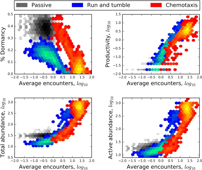
Figure 5.
Heat maps revealing a negative relationship of encounter to the relative size of the seed bank (% dormancy) and positive relationships of encounter to the production of new individuals (productivity), and to the abundance of the total and active communities. In each plot, blue heat maps represent the results of models that included “lock-and-key” chemical complexity (complex molecules) and excluded active dispersal. Red heat maps represent the results of models that excluded chemical complexity (simple molecules) but included chemotaxis. Greater heat, i.e., areas within heat maps that have lighter colors, corresponds to a greater number of model results.

