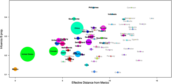
Figure 1. The proportion of influenza B from 72 countries against their effective distance from Mexico (week 1 of 2010 to week 40 of 2015).
We use disks to represent individual countries. The size of the disk is proportional to square root of the original size in order to enlarge the smaller values. Names of the top 34 countries used in the main analysis are in black and others in dark grey. Countries are coloured according to their geographic regions or sub-regions.

