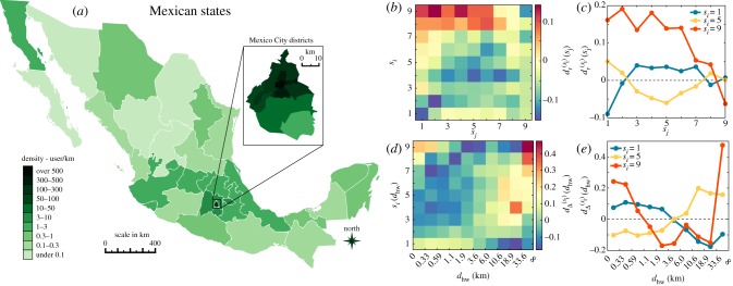
Figure 4.
Spatial socioeconomic correlations. (a) State level population distribution of individuals based on their zip locations. Inset depicts a zoom on the capital district. Information details depicted here were entirely obtained from the used dataset. The map representation was generated by using an open source code available at https://gist.github.com/diegovalle/5843688github.com/diegovalle (no copyright reserved) and shape files openly available at http://www.inegi.org.mxwww.inegi.org.mx (no copyright reserved). (b) Relative average geodesic distances for different classes using the measure  defined in equation (2.8). (c) The same
  functions as on panel (b) shown for a selected set of classes (1-poor (blue), 5-middle (yellow), 9-rich (red)). (d)
  differences between commuting distance distributions calculated for different classes and for the whole population. x-scale depicts in logarithmic values of dhw commuting distances. (e) The same
  functions as on panel (d) shown for a selected set of classes (1-poor (blue), 5-middle (yellow), 9-rich (red)).

