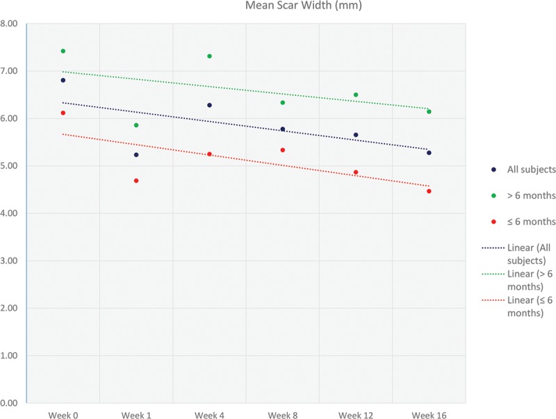
Fig. 2.

Graph illustrating the mean change in scar width (mm) at the various time points (0, 1, 4, 8, 12, and 16 wk). Linear trend lines were included to more clearly illustrate the data. The data are represented as 3 groups: all subjects, <6 months, and >6 months.
