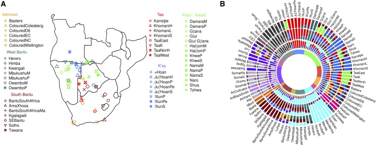
Figure 1.
The genetic structure of southern Africa populations. (A) Southern Africa populations analyzed in this study. Different Colours are associated with different language/ethnic affiliation. The complete dataset used for analysis is shown in Figure S1 and Table S1. (B) Admixture results for (from the inner to the outer circle). Colours at the center reflect the affiliation shown at (A) and Figure S1. We analyzed 1856 individuals for 91 populations, and averaged the results in a population based barplot. The full set of results () for individuals and populations is reported in Figure S2 and Figure S3.

