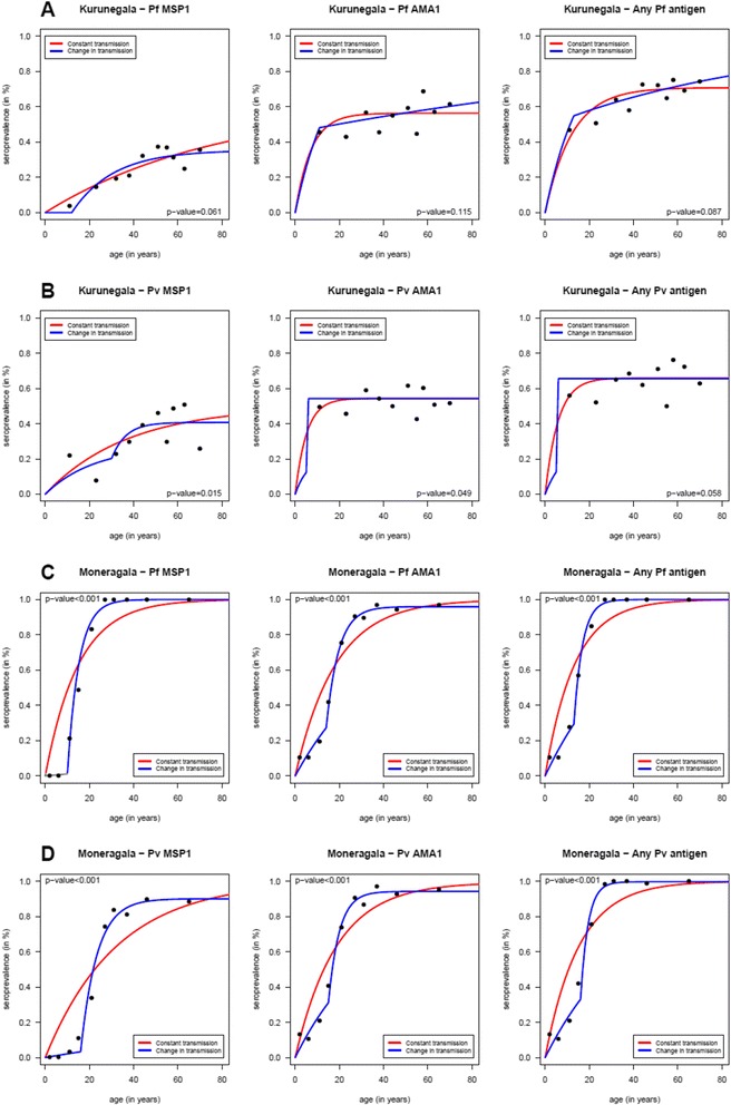
Fig. 3.

Age specific sero-prevalence curves for each tested antibody. Age specific sero-prevalence curves for Kurunegala (a-b) and Moneragala (c-d) districts for P. vivax and P. falciparum antibodies. Each graph shows the age specific sero-prevalence where the dots represent the observed sero-prevalence when the age distributions were divided into the respective 10%-centiles. Reversible catalytic models assuming a constant transmission intensity (red lines) and change in transmission intensity at a specific time (blue lines) were estimated for each tested antibody using the maximum likelihood and the profile methods, respectively. P-values refer to the likelihood ratio tests for comparing the two reversible catalytic models
