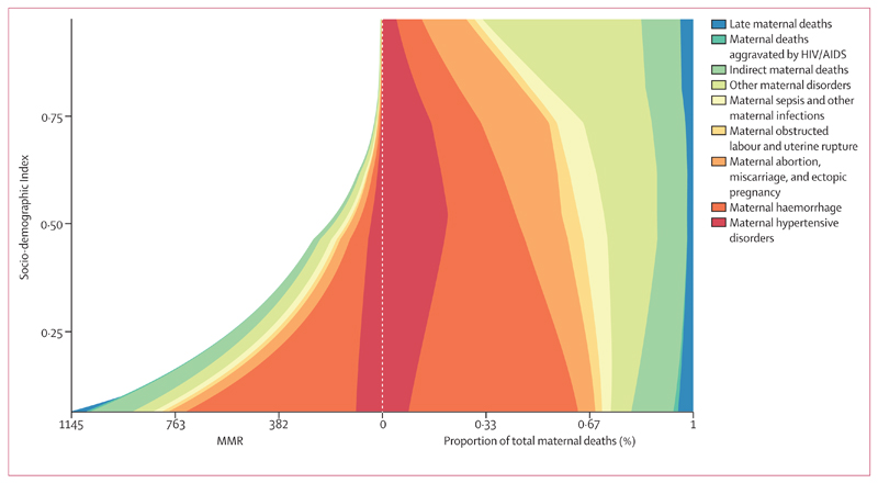
Figure 8. Expected relationship between cause-specific maternal mortality ratio (MMR; number of livebirths per 100 000 livebirths) and SDI (left) and proportion of maternal deaths due to each underlying cause and SDI (right).
These stacked curves represent the average relation between SDI and each cause of maternal mortality observed across all geographies over the time period 1990–2015. In each figure, the y axis goes from lowest SDI up to highest SDI. To the left of the midline are maternal mortality ratios (MMR; number of deaths per 100 000 livebirths), and the right-hand side shows the proportion of the total in order to highlight the different cause pattern in high SDI locations. SDI=Socio-demographic index.

