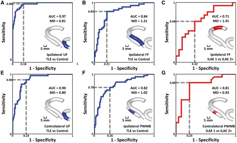
Figure 4.
ROC curves. In all cases, blue indicates separation between patient and control groups and red indicates separation between patient outcome groups. The area under curve (AUC) is used to assess quality of the ROC curves and the dashed line gives example sensitivity and 1-specificity calculations. MD represents mean diffusivity and the value indicates the corresponding test threshold in units of (µm2/ms). The inset for each curve indicates the location of the region of interest used to calculate the ROC curve, which was selected based on observed group differences in mean diffusivity. FF = fimbria-fornix; PWMB = parahippocampal white matter bundle; UF = uncinate fasciculus.

