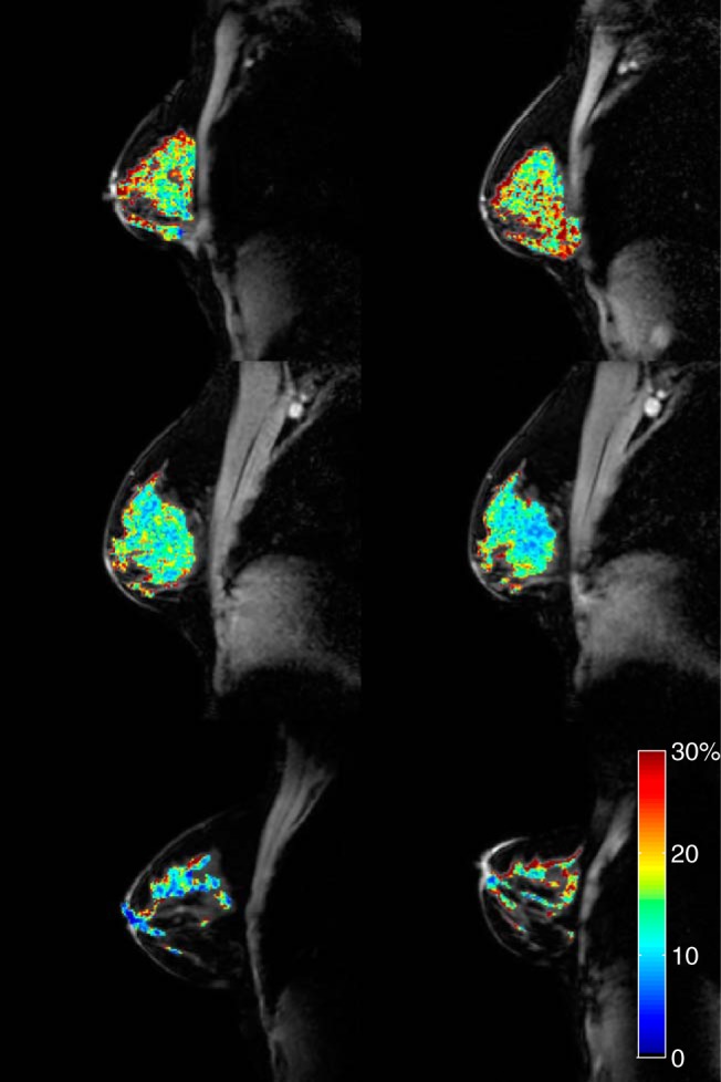
Figure 2.

Reproducibility in healthy controls. From top to bottom, each row displays examples of the best (|d| = 0.1%), average (|d| = 0.9%), and the worst (|d| = 2.1%) cases, based on the absolute value of the difference (|d|) between the mean fibroglandular (FG) PSR values from scan 1 (left column) to scan 2 (right column). The PSR maps are displayed as overlays on the corresponding normalization images.
