
Fig. 1.
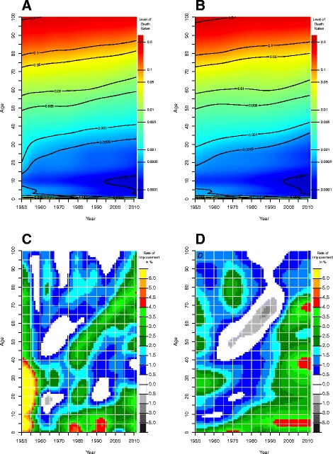
Input of our model. Upper panel: (smoothed) death rates for women in the UK (a) and Denmark (b). Lower panel: rates of mortality improvement (in %) for women in the UK (c) and Denmark (d). Source: Authors’ estimations based on data from the Human Mortality Database (2013)