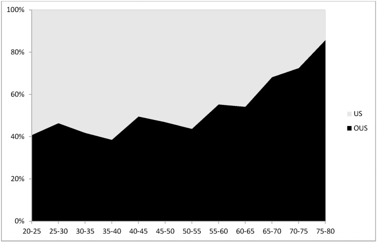
Fig 1. Distribution in age of the DIET population.
X axis was age (divided into subgroups of 5 years). Y axis was percentage of population for each category of age. US patients are depicted in grey; OUS patients are depicted in black. P < 0.0001 for comparing the overall differences between US versus OUS.

