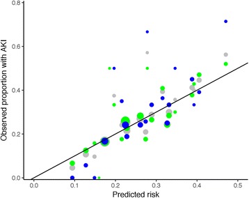
Fig. 5.

Calibration plot for model 1. Data for the full dataset are shown in grey, for the training set in green and the testing set in blue. The area of the points is proportional to the number of cases in each group. The line represents the line of equality, where observed and predicted outcomes are equal
