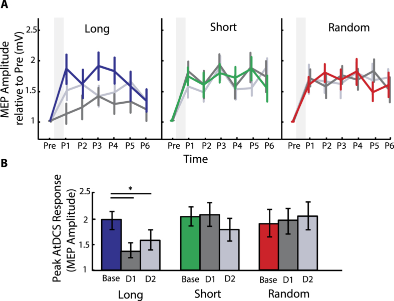
Figure 5. M1 LTP-Like Plasticity Aftereffects.
(A) MEP amplitude ratios for pre and post AtDCS. y-Axis represents the mean MEP amplitude normalized to the pre-AtDCS MEP amplitude, and the x-axis presents TMS measurements taken before application of AtDCS (pre), immediately after AtDCS (Post 1, P1) and repeated every 5 minutes up to 25 min after AtDCS (P2…P6). The left, middle and right portion of the graph depicts MEP amplitudes for individuals of the Long, Short and Random group respectively. Colored lines represent the timeline of MEP amplitude responses for all subjects on Day0 (baseline session), whereas dark grey and grey present responses after Day1 and Day2 training session. The gray shadowed columns represent the time when AtDCS was applied. Note, all groups demonstrated an increase in excitability in response to AtDCS for the baseline session. (B) The bar graphs show the peak MEP amplitude response following AtDCS for each session. Only participants of the Long group showed significant occlusion of LTP-like plasticity after each training session when compared to baseline responses. Data are means ± SEM. *p ≤ 0.05.

