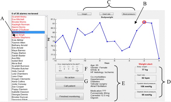
Fig. 3.

Final GUI design – all names displayed are fictitious. Key: a. List of patients in case-load. Patients highlighted in red have alerts that need to be reviewed. b. Measurement data review panel. Data points circled in red indicate an alert. c. Buttons to review other measurement data. This will appear in panel B. d. Most recent HTM measurements. e. Patient demography, co-morbidities and current medication. f. Participant rates the meaningfulness of the alert here. g. Response buttons: No Action or Call Patient
