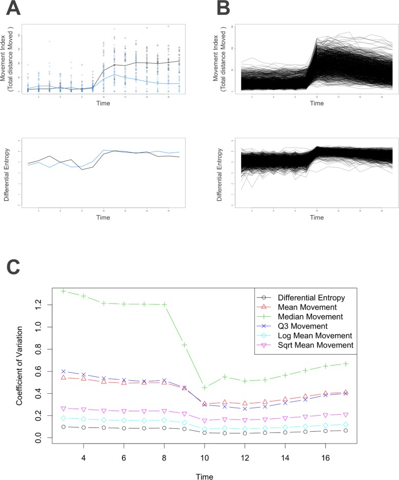
Fig 4. Performance of Our Novel Statistical Modeling Method.
A: Example controls (having similar survival rates) illustrate the transformation. These two separate controls were plotted by different colors. Blue: TX000769 (Propoxycarbazone-sodium); Black: TX000900 (Methamidophos). Top: Movement index of each time point, and the line was drawn by connecting the mean movement indexes. Y axis: Movement index; X axis: Time. Bottom: Lines were drawn using our method, which connects the differential entropy of each time point. Y axis: Differential entropy (Nats); X axis: Time. B: All 1,060 control groups were plotted. Top: Each line represents a chemical. Line was drawn by connecting mean movement indexes. Y axis: Movement index; X axis: Time. Bottom: Each line represents a chemical. Line was drawn by connecting differential entropy across time. Y axis: Differential entropy (Nats); X axis: Time. C: Coefficient variation of each time point using all control groups and various statistical modeling methods. Y axis: Coefficient of Variation; X axis: Time.

