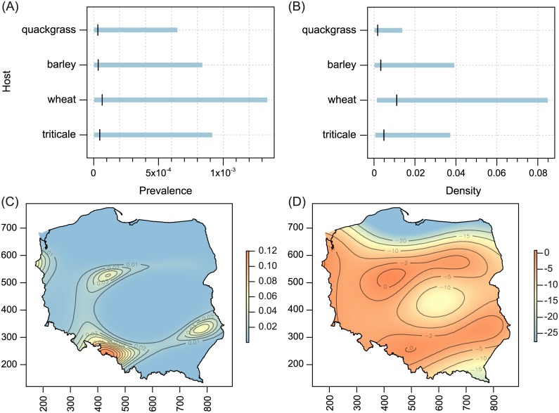
Fig 2. Host-related differences in prevalence (A) and population density (B), and spatial patterns of prevalence (C) and population density (D) for WCM MT-1 lineage.
On (A) and (B), the black vertical tick represents the mean, and the blue horizontal bars are 95% confidence intervals. On (C) and (D), x-axis: increasing values more easterly, y-axis: increasing values more northerly. Colors on the maps represent fitted trend surfaces. For the prevalence they are expressed on the predictor scale (so they are predicted probabilities of occurrence) and for the density (i.e. the number of individuals per shoot) they are on the linear predictor scale (showing the logarithms of the predicted population densities).

