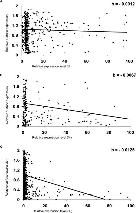
Figure 2.
Quantification of the transport assay. Image acquisition of transfected cells, quantitation of fluorescence, data analysis, and classification of inhibitors were as described in Methods. The normalized amounts of ts-O45-G arriving at the PM (relative surface expression) are plotted as a function of the relative amounts of GFP protein expressed. (A) Example scatterplot of YFP-transfected cells. (B) Example scatterplot of cells transfected with the weak effector AF220052. (C) Example scatterplot of cells transfected with the strong effector AL136711. The linear curves were fitted to the data as described in Methods. The slopes (“b”) of these curves are given in the right upper corner of each graph. The steepness of the slope reflects the progression of the strength of inhibition with increasing amounts of transfected GFP-tagged protein.

