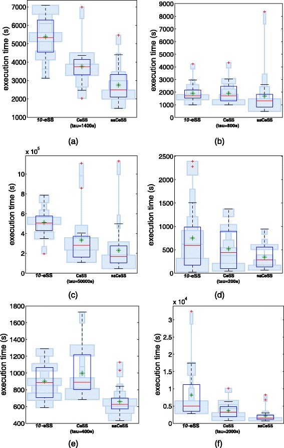
Fig. 7.

Hybrid violin/Box plots of the execution times using 10 processes. Results for experiments reported in Table 1.The green asterisks correspond to the mean and light blue boxes illustrate the distribution of the results. Each box with a strong blue contour represents a typical boxplot: the central red line is the median, the edges of the box are the 25th and 75th percentiles, and outliers are plotted with red crosses. (a) B1, (b) B2, (c) B3, (d) B4, (e) B5 and (f) B6
