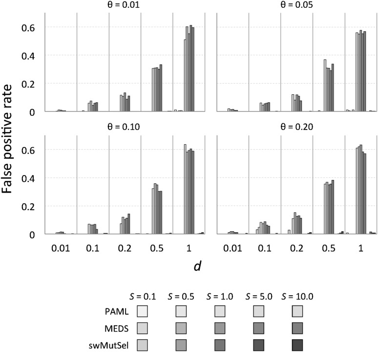
Fig. 4.
False positive rate of PAML, MEDS and swMutSel on simulated data. The green bars represent the false positive rate (fraction of sites undergoing purifying selection misidentified as under positive selection) of PAML, the red bars represent the false positive rate of MEDS and the blue bars represent the sensitivity of swMutSel. Colors and shades are as in Fig. 3. For the PAML results, the false positive rates shown are from the combinations that passed the LRT and were misidentified using the BEB analysis. For both with PAML and swMutSel, the false positive rate is quite low (<5%) (Color figure online)

