
Fig. 1.
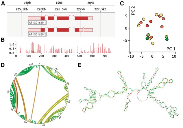
(A) d3nome genome browser, indicating splice isoforms. (B) Normalized reactivities. The sequence position is shown on the x axis, whilst the y axis provides the normalized reactivity value. (C) Principal components analysis, indicating structural similarity. Each dot represents a single RNA structure prediction, with red dots indicating the lowest free energies. Structures with similar base pair configurations are plotted in close proximity to each other. (D) Circle plot describing a single RNA structure prediction. Sequence positions are indicated around the edge of the plot, with lines between positions indicating base pairs. Green lines indicate high base pair probability. (E) RNA fold prediction diagram. Bases with high reactivities are in red, whilst green indicates little or no reactivity