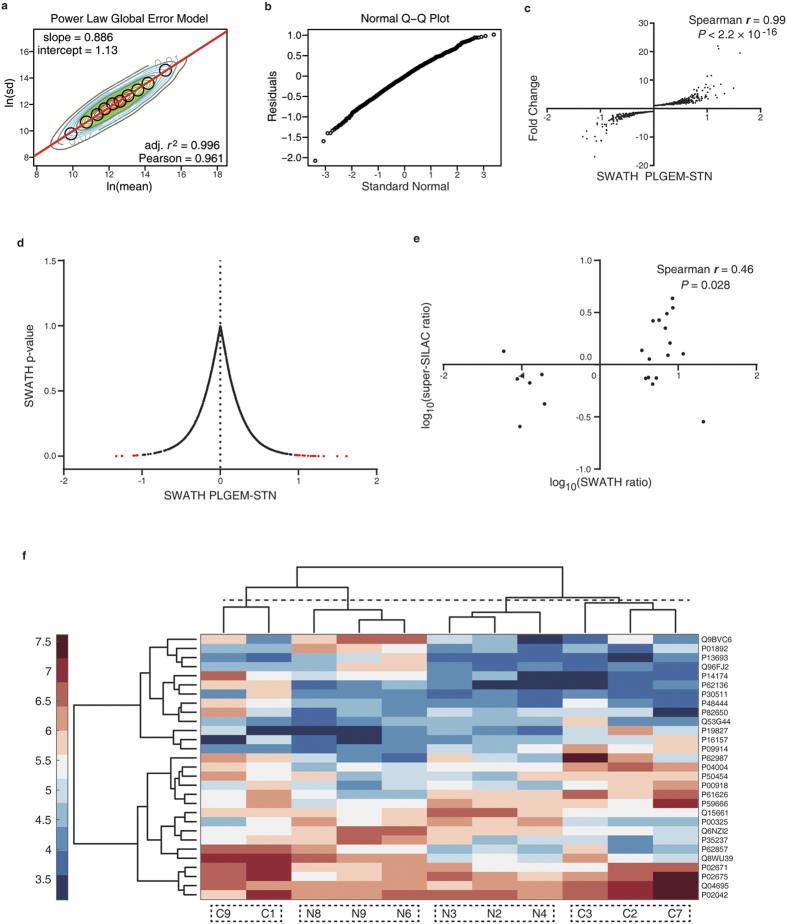
Figure 2. Determination of differentially expressed proteins in SWATH-MS.
(a) Contour plots of ln (rowCV) versus ln (rowMean) scatter plots and the regression fitting analysis with PLGEM model. Black circles indicate the modeling points used to fit a PLGEM model. (b) Quantile-quantile (Q-Q) plot. (c) Correlation of signal-to-noise ratios (STN) and protein abundance fold changes. (d) A volcano plot showing the relationship between the PLGEM-STN and the p-value calculated by PLGEM. The DEPs are shown in red (P < 0.01). (e) DEP fold change correlation of SWATH-MS and super-SILAC MS analyses. (f) Cluster analysis using DEPs. C represents subjects with NPC, and N stands for normal subjects.

