
Fig. 1.
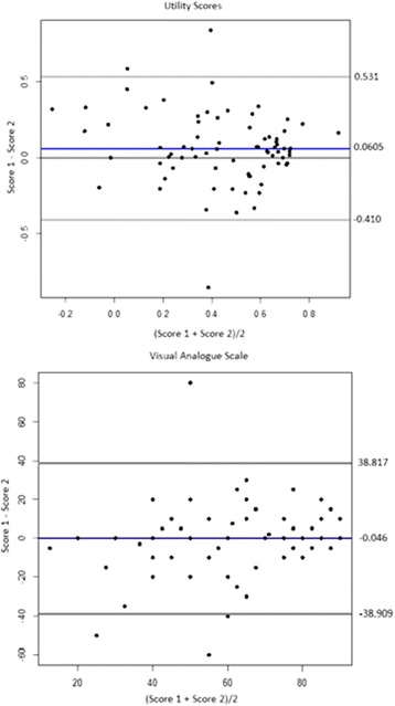
Bland Altman plots demonstrating the limits of agreement for utility and VAS scores. The mean difference and 2 standard deviations from the mean are respectively indicated by the blue and grey lines
Official websites use .gov
A
.gov website belongs to an official
government organization in the United States.
Secure .gov websites use HTTPS
A lock (
) or https:// means you've safely
connected to the .gov website. Share sensitive
information only on official, secure websites.
Bland Altman plots demonstrating the limits of agreement for utility and VAS scores. The mean difference and 2 standard deviations from the mean are respectively indicated by the blue and grey lines