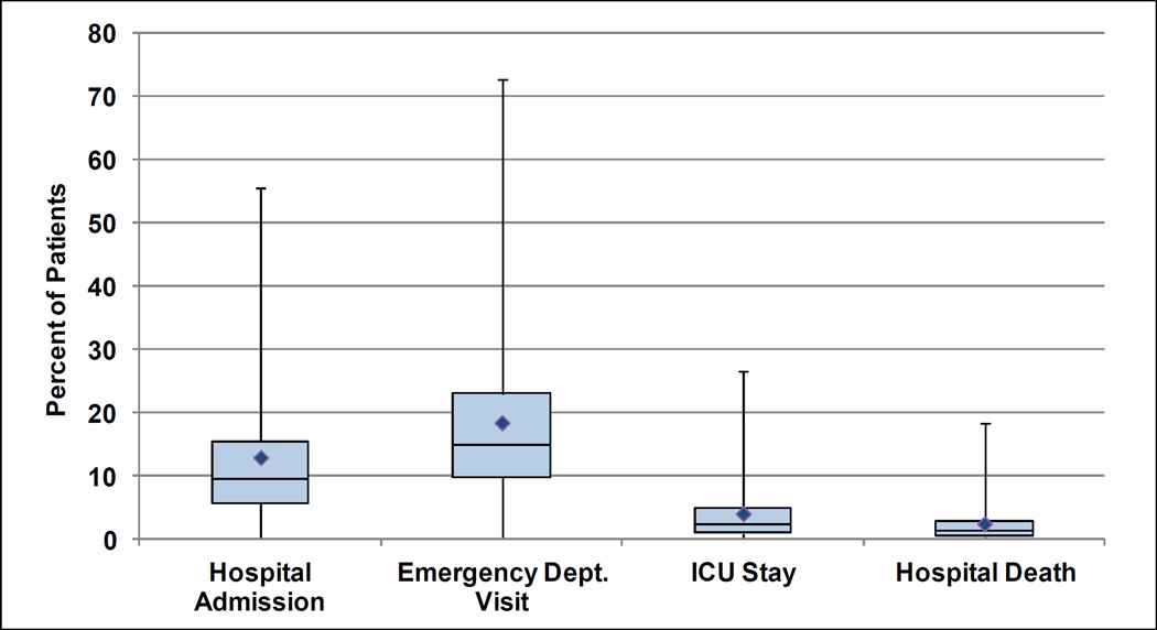
Figure 1. Variation Among Hospices in the Proportion of Patients with Each Hospital Utilization-Based Outcome.
This figure is a box-plot describing the distribution of the proportion of patients with each hospital-based outcome among the hospices in our sample. The bottom and top of the box represent the first and third quartiles of the distribution and the band inside the box is the second quartile or median. The diamond represents the mean. The ends of the lines represent the first and ninety-ninth percentile values of the distribution.

