Fig. 4.

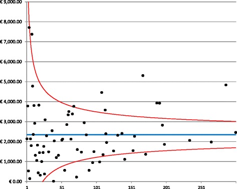
Funnel plot for follow-up costs. The graph depicts the dispersion around the mean costs (blue line) for each provider (black dots) as a function of the hospital volume. The red lines represent the 95% confidence interval around the mean

Funnel plot for follow-up costs. The graph depicts the dispersion around the mean costs (blue line) for each provider (black dots) as a function of the hospital volume. The red lines represent the 95% confidence interval around the mean