
Figure 1.
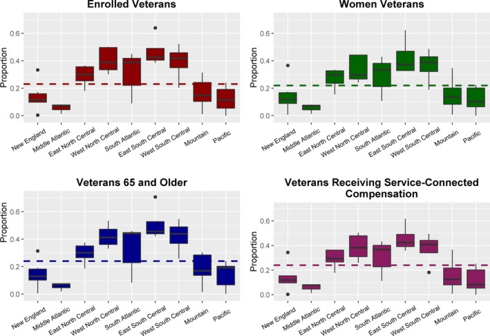
State‐Level Population Proportions (Shortage Area Counties vs. All Counties), 2015, by Group and Census Division Note: Dashed lines indicate national proportions. For example, the national proportion of Enrolled Veterans in Shortage Area Counties is 0.23. [Color figure can be viewed at wileyonlinelibrary.com].