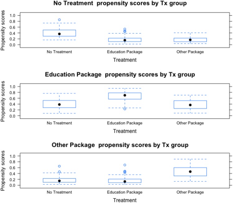
Fig. 1.
Boxplot illustrating the spread of propensity scores by treatment group for receiving each treatment (i.e. no treatment, education package, and other package). The filled black circles indicate the median propensity score in each treatment group. As the plot demonstrates, there was substantial overlap in the total spread of propensity scores, but the central tendency differed by treatment group.

