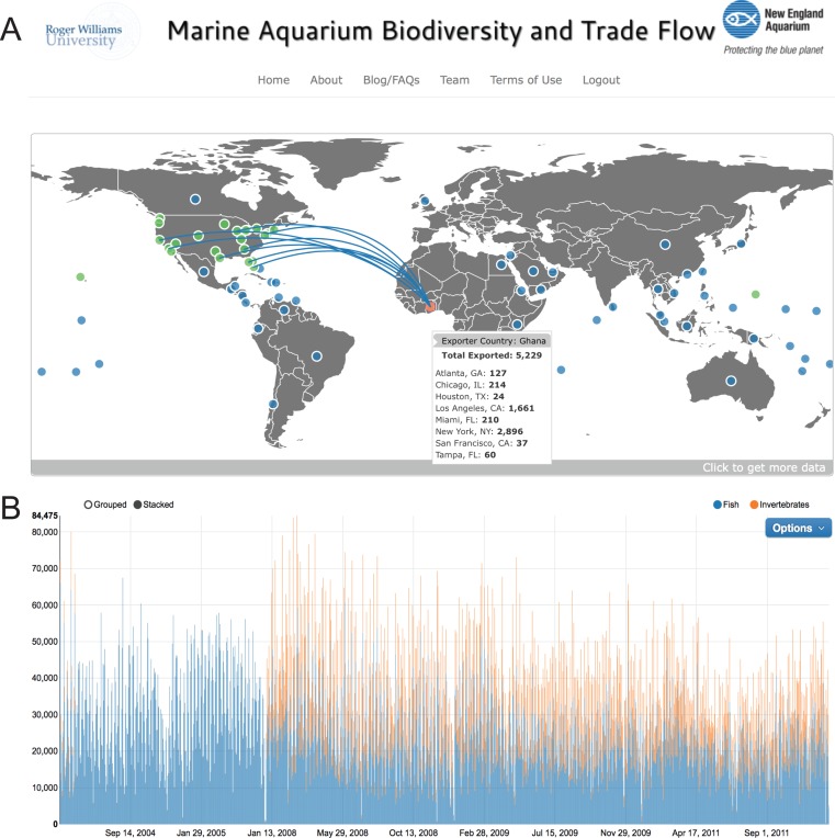
Figure 2. Main dashboard page of www.aquariumtradedata.org.
(A) Interactive trade flow map depicting exporting countries (blue circles) and ports of entry in the US (green circles); (B) Timeline chart of fishes and invertebrates imported into the US based on user-selected dates.

