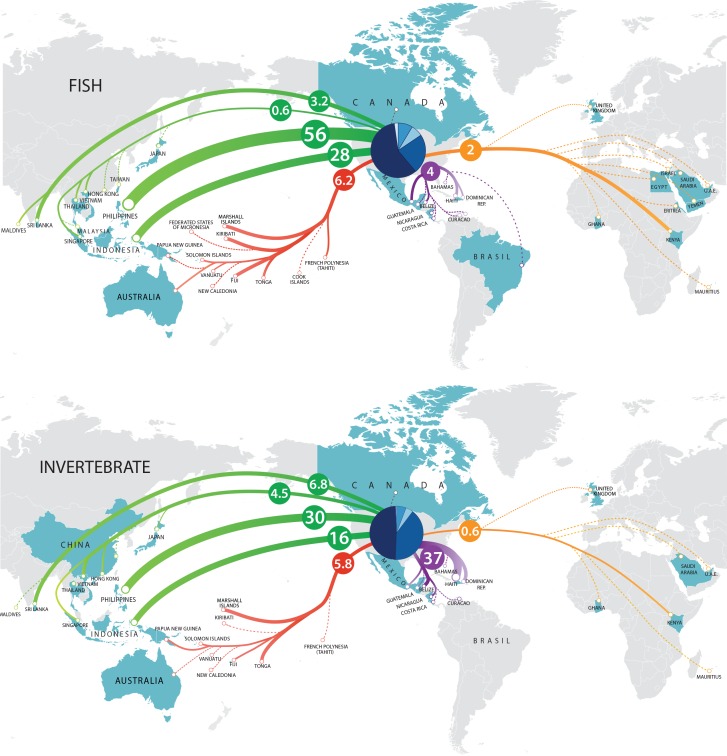
Figure 5. Trade flow of marine aquarium fishes and invertebrates from source nations into the US during 2008, 2009 and 2011.
Numbers within circles denote percent contribution to total imports. Pie chart within US represents Ports of Entry (with the Midwest starting at 0 degrees, and clockwise, NE, SE, SW and NW).

