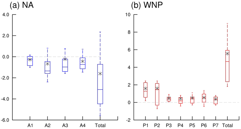
Figure 3. Boxplots of difference in occurrence frequency for each cluster of NA and WNP TCs between the late 21st century (2080–2099) and the present climate period (1986–2005).
Uppermost and lowermost black dashed lines indicate upper and lower deciles of differences in TC occurrence frequencies of the models, respectively. Upper, middle, and lower lines of boxes represent upper quartile, median, and lower quartile of the differences, respectively. Asterisks indicate averages of the differences. Gray dashed lines indicate zero values. Red and blue boxes indicate that both of the median and average show same sign of differences, respectively.

