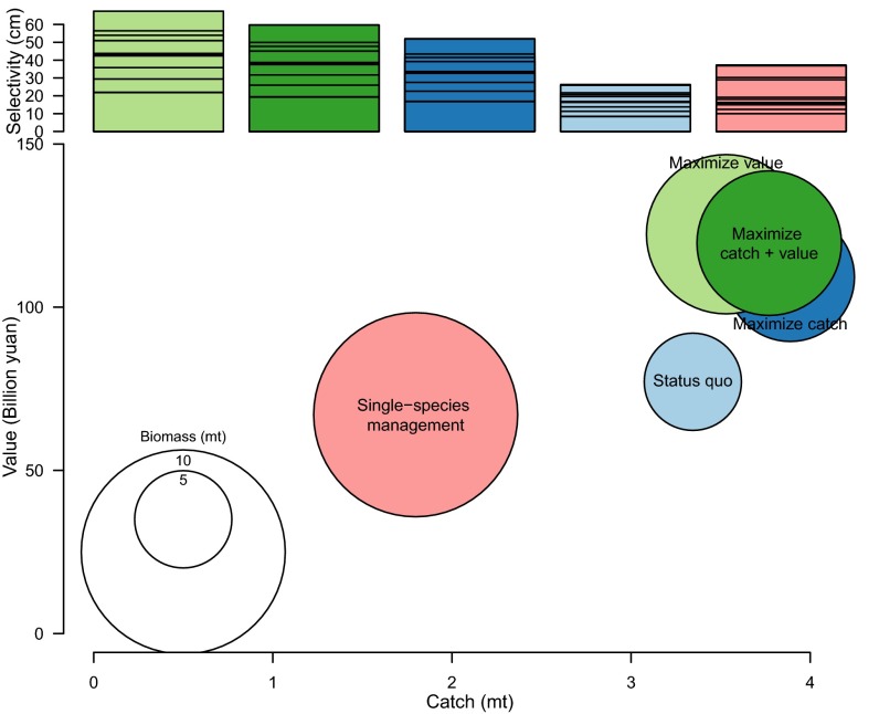
Fig. 3.
Ecosystem-wide catch (x axis), biomass (circle size), and value (y axis) by management strategies. Bar plot at the Top displays the selectivity by strategy, color-coded to match the circles representing scenarios within the main figure. The lines in the selectivity bars represent the individual selectivities for each species and can be seen in tabular format in SI Appendix, Fig. S9.

