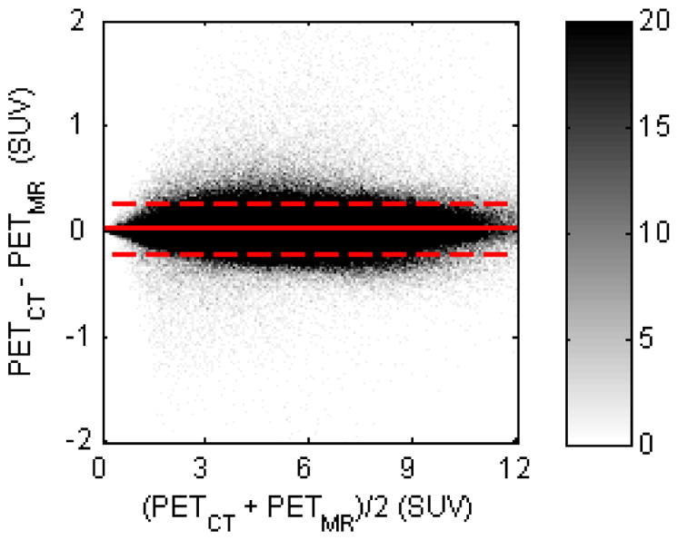
Fig 4.

Bland-Altman plot for comparison between PETCT and PETMR (in SUVs) of all brain voxels for all subjects. The difference and average of all voxels were calculated and sorted into a histogram; the color bar shows the density of voxels in each histogram bin. The dashed line indicates the 2σ limit
