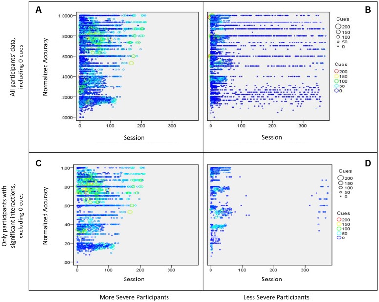
FIGURE 5.
Bubble plot of participants’ interaction between sessions (time) and cue use on normalized accuracy split by severity. The size of the bubble as well as the color of the data point represents the number of cues used in a session. More specifically, (A) shows data for all more severe participants (WAB-R AQ < 75), including sessions where participants used zero cues, (B) shows data for all less severe participants (WAB-R AQ > 75), including sessions where participants used zero cues, (C) shows data for more severe participants that showed a significant interaction effect from the regression examining cue use and time on normalized accuracy, and (D) shows data for less severe participants that showed a significant interaction effect from the regression examining cue use and time on normalized accuracy.

