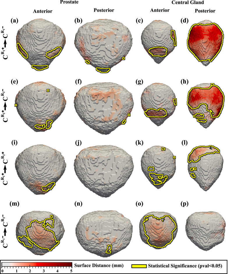
Figure 1. Shape differences between subpopulations illustrated as a distance map between the shape of the prostate (columns 1–2) and CG (columns 3-4).
Yellow outlines show statistically significantly different regions when comparing (a-d)  with
with  constructed using the delineations of rater 1; (e–h) or
  with
with  constructed using the delineations of rater 2, (i–l)
  with
with  , and (m–p)
  with
with  .
.

