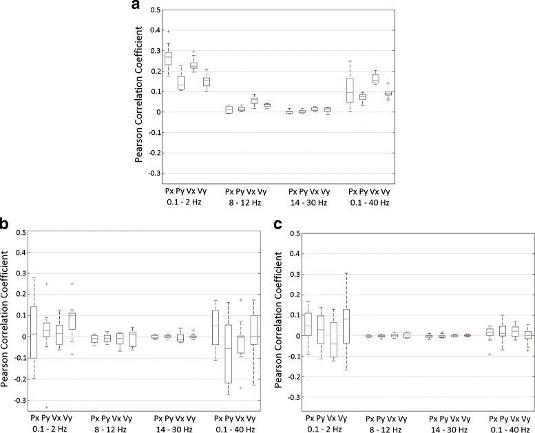
Fig. 5.

Frequency analysis. Comparison between different frequency bands: 0.1–2 Hz (low frequencies), 8–12 Hz (alpha band), 14–30 Hz (beta band) and 0.1–40 Hz. The boxplot represents the Pearson correlation coefficient obtained after computing a cross-fold validation between all runs (n=10) for each subject and then averaged between subjects (n=5). On each box, the central mark is the median, the edges of the box are the 25th and 75th percentiles, the whiskers extend to the most extreme datapoints which are considered not outliers, and the outliers are plotted individually. Position (Px and Py) and velocity (Vx and Vy) are shown for different experimental data: center-out movements (a), shuffled data (b) and random data (c)
