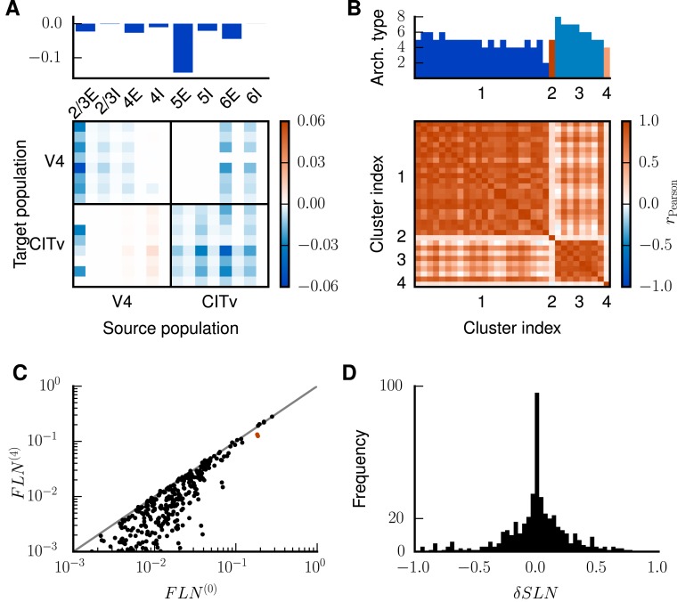
Fig 8. Analysis of changes in connectivity.
A Top panel: relative changes in population-specific intrinsic indegrees summed over target populations and averaged across areas, . Bottom panel: changes in the indegrees within and between exemplary areas V4 and CITv relative to the total indegrees of the target populations, i.e., . Populations ordered as in Fig 7C. B Pearson correlation coefficient of the changes of the internal indegrees between all pairs of the 32 areas. Areas ordered according to hierarchical clustering using a farthest point algorithm [31]. The heights of the bars on top of the matrix indicate the architectural types of the areas (types 1 and 3 do not appear in the model) with color representing the respective clusters. C of the modified connectivity after 4 iterations versus the original of the model. Only are shown for a better overview. The overlapping red dots represent the connections between areas 46 and FEF. Unity line shown in gray. D Histogram of the cumulative changes in over all four iterations .

