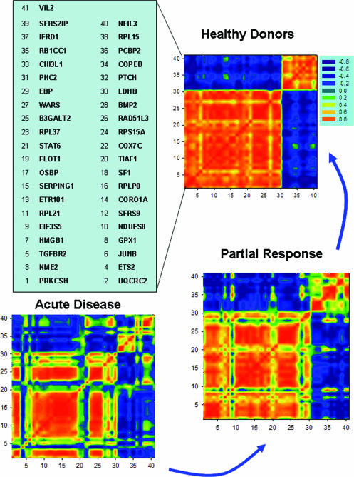
Figure 4.
Correlation mosaics for genes from the two largest clusters in the control group. Each spot in the plot presents correlation coefficients of expressions for genes along the axes. A red spot is highly correlated, conversely a blue spot is highly anti-correlated. Gene order is chosen to present joined co-expressed genes in two largest clusters of the HD samples. The same order of the genes along axis is used for all three mosaics.

