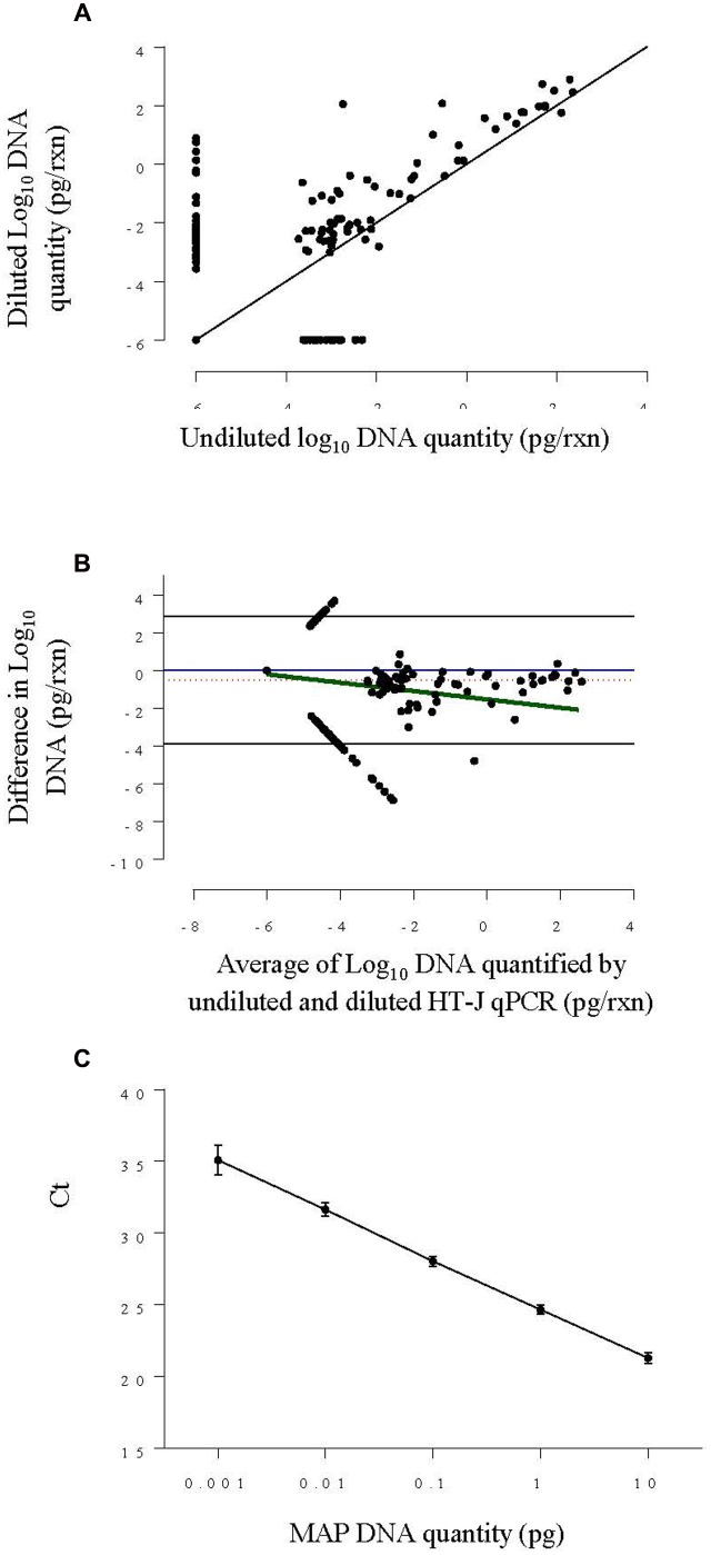
FIGURE 2.
(A) Scatter plot of log10 DNA quantified by HT-J qPCR of undiluted fecal DNA extracts against diluted DNA extracts from Experiment 1. The solid black line is the ‘line of equality.’ (B) Bland–Altman difference plot comparing log10 DNA quantity of the undiluted and diluted and fecal DNA extracts from Experiment 1, by plotting the difference in MAP DNA quantified against the average DNA quantified. The solid blue line represents the optimal agreement also termed the ‘zero line’ and the region of agreement (95% confidence interval) is plotted as black lines. The dotted red line shows the average difference and the solid green line shows the regression line of the difference on the average. (C) Standard curve plotted by combining results from four individual standard curves constructed using 0.001–10 pg per reaction of MAP genomic DNA concentration. The point represents the mean Ct and the error bars represent ±SD of Ct.

