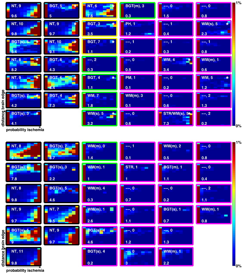
Fig. 4.
Per-subject heat maps which illustrate the findings of the algorithm at a glance. For each subject X-axis shows probability of ischemia, Y-axis shows distance to brain edge. Section 4.2.1 provides detailed information. The white text to the upper-left is the clinician note on injury pattern. The digits following this indicate the modified Barkovich score, while the number on the lower left indicates the algorithm score (see Section 4.2.2). The outline colour implies the outcome of the subject: black: subject died, yellow: abnormal, green: normal [below mean], magenta: normal [above mean]. (a) Heat maps for subjects scanned on 1.5 Tesla scanner (Datasets A and B). Subjects from Dataset A (training set) are denoted with an asterisk in the top right corner. (b) Heat maps for subjects scanned on 3 Tesla scanner. (Dataset C).

