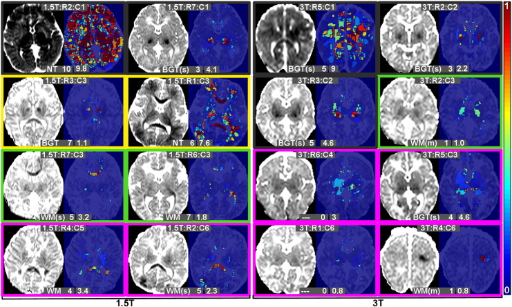
Fig. 5.
Examples showing representative ADC slices for a number of subjects along with the probabilistic algorithm findings. All ADC maps have the same contrast and brightness settings to enable comparisons. Probabilities are colour coded from 0 to 1 according to the colour-bar shown on the right. Border colours represent outcome as described in Section 4.2.1. The upper text represents the subject position in the heatmaps of Fig. 4. The lower text provides the clinician note and modified Barkovich score, as well as the algorithm final score (Section 4.2.2).

