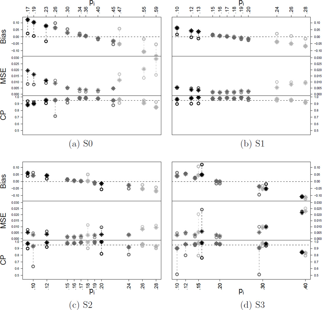
Figure 1.
Summary of simulation results under scenarios S0 through S3. The plots compare the estimated success probabilities under the NEPPM (star “*”) vs. the PEM (circle “○”). The horizontal axis shows the n = 12 true success probabilities under the assumed scenario. The upper, medium and lower panels show the bias, mean square error and coverage probability of the central 95% credible interval, respectively. Under S0 and S1, from left to right, the first three success probabilities correspond to poor prognosis (xi = −1), the following six to intermediate (xi = 0) and the last three to good prognosis (xi = 1). The pi with equal values were jittered in the plot for display purposes.

