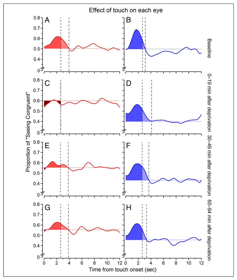
Figure 4.
Average effect of touch. The average effect of touch on binocular rivalry is represented by the area subtended by the curve between touch onset and the time that the baseline values are reached. The left column (A, C, E, and G, in warm colors) refers to the deprived eye, whereas the right column (B, D, F, and H, in cold colors) refers to the nondeprived eye. The lighter colors represents the effect of touch extending after touch offset (dashed vertical line) until the curve decayed to baseline (dotted vertical line). The darker colors represent negative areas, that is, portions of the curve that lied below the vision-only base proportion. The probability curves are the same of those in Figure 3, after been smoothed with a Gaussian function with constant equal to 2.4 sec—this was done only for visualization purposes.

