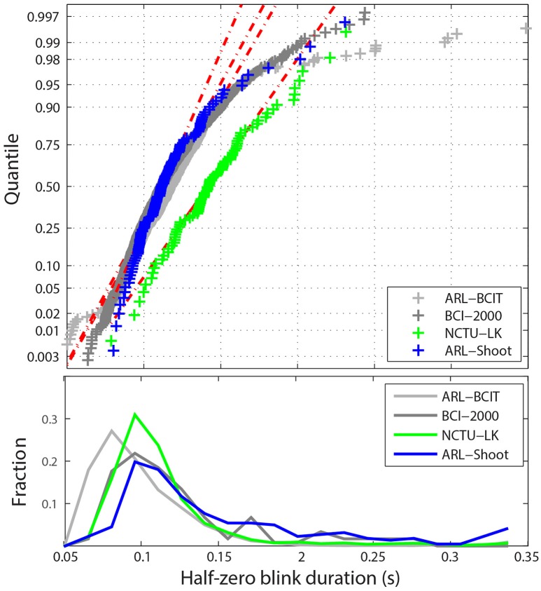
Figure 5.
Distribution of blink durations for the four collections. Top panel shows a quantile plot against the normal distributions of the average half-zero blink duration for each dataset. The red dotted lines represent the best-fit normal distributions for the each of the four collections. Bottom panel shows the histogram of individual half-zero blink durations for each collection.

