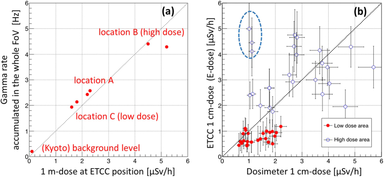
Figure 6. Correlation plots between the doses measured by a dosimeter and the ETCC.
(a) Correlation plot between the gamma rate for the whole FoV of the ETCC and 1-m dose at the position of the ETCC. (b) Correlation plot between the 1-cm dose and E-dose within FoV of 80ο ϕ as explained in the caption of Fig. 3. The dotted line is the best-fitting result of a linear fit for all the data points except 3 points indicated in a dotted ellipse, of which the doses (or brightness) are strongly affected from the hot spot in Fig. 4e due to the proximity of their positions to the hot spot compared with the size of the PSF of the ETCC.

