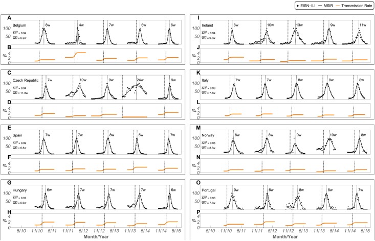
Fig 5. Best MSIR fitted results in converging countries, from 2010–2015.
Panels A, C, E, G, I, K, M, and O show the best MSIR fitting results and averaged AR2, where a rescaled EISN-ILI rate with the season peak set to 100 was used. Panels B, D, F, H, J, L, N, and P show the corresponding transmission rate (β). Dashed vertical lines connecting both panels show the transmission rate inflection point. The week difference (WD) between the infection point and the maximum MSIR fit is shown for each season and its average shown on the left of the top panels.

