
Fig 5.
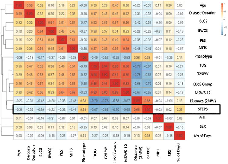
Bivariate associations between average steps per day and all demographic, clinic-based and patient-reported variables. The heat-map (to the right) graphically depicts the direction of correlation, with red tones trending towards positive (+1) and blue tones indicating negative correlations (-1). Correlations are computed using the Spearman's q. The Dendrogram (to the left) is the branching diagram, depicting the strength of the relationships between all of the included outcomes and shows all outcomes hierarchically clustered in relation to the strength of correlation (Spearman's q) regardless of the direction of association. The distance used for clustering here is equal to 1–C^2, with C the correlation. diseaseDuration the duration of the disease, subtype_cat MS subtype/phenotype category (Relapsing or Progressive), EDSSgroup EDSS grouped into blocks, nDay the number of valid days of Fitbit step count data, dist2M distance walked during the 2MW test, STEPS average number of steps/day over 4 weeks.