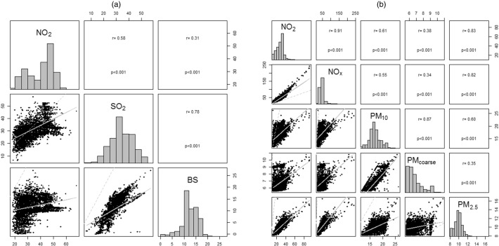
Fig. 2.
Histograms of air pollutants for the combined SABRE + NSHD cohort (diagonal), scatter plots (straight line representing the linear fit between the two air pollutants; dashed line the identity line) (below the diagonal) and correlations between air pollutants (above the diagonal). (a): contemporaneous 1991 estimates. (b): ESCAPE 2010–11 estimates.

