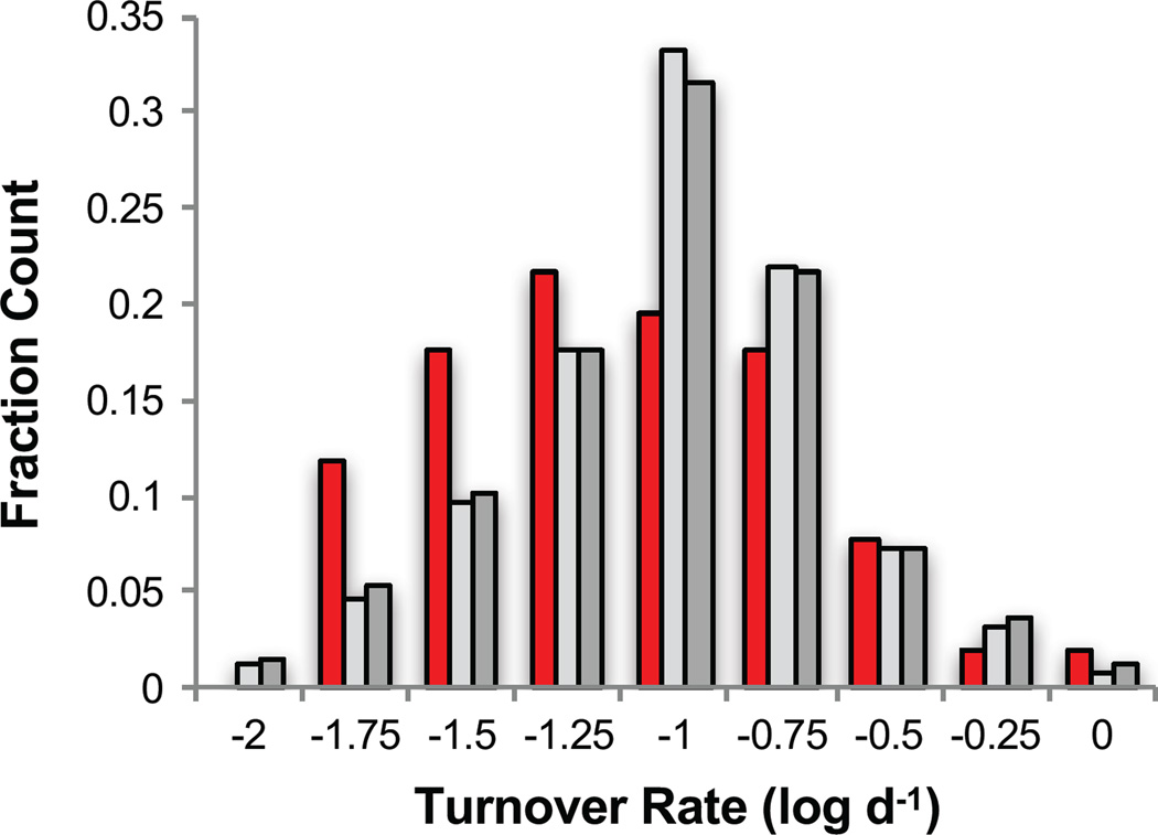
Figure 6.
Bar graph showing the distribution of protein turnover rates previously measured in reference 44 for 51 of the brain protein hits identified here (red shaded bars), for 486 of the brain assayed proteins identified in this work (light grey shaded bars) and for all of the 1007 brain proteins analyzed in reference 44 (dark grey shaded bars). Each bar represents the fraction of the total protein population within each rate bin. The high limit of each bin is listed on the x-axis.

