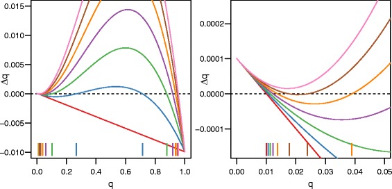
Fig. 1.

As selection increases, the evolutionary dynamics of the cave population changes. When s is low (red line; s=0), there is only one equilibrium: near 0. As s increases (blue–brown lines, s=0.05,0.1,0.15,0.2, and 0.25) the local maximum (upper hump) increases and crosses the x-axis, producing three equilibria. When s gets high enough (pink line; s=0.3), the local minimum (lower valley) also crosses the x-axis, resulting in one equilibrium again. The location of the equilibria are marked using vertical lines at the bottom of the chart. For all curves m=0.01, h=0, u=10−6, and Q=0.01. The figure on the right is an enlarged view of a small part of the figure on the left
